Crash Records
Redesign of a webshop
The aim of the redesign of Crash Records website is to structure the elements in the webshop and design an harmony in visual appearance, providing viewers a better user experience. Generally, the visual structure of the webshop is chaotic and full of information. The following elements of the webshop could beimproved. The list is generated in order of importance:
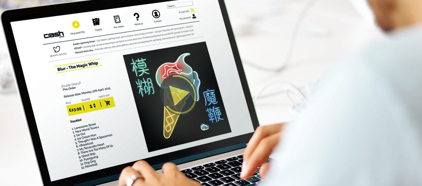
1. Colour theme: the current version makes album artworks look unaesthetic. The bright neon yellow grabs too much attention and is tiring for eye, resulting in a shift of focus from contents of the website.
2. On landing page the cart elements are not aligned with each other.
3. Logo does not communicate the essence of a record shop.
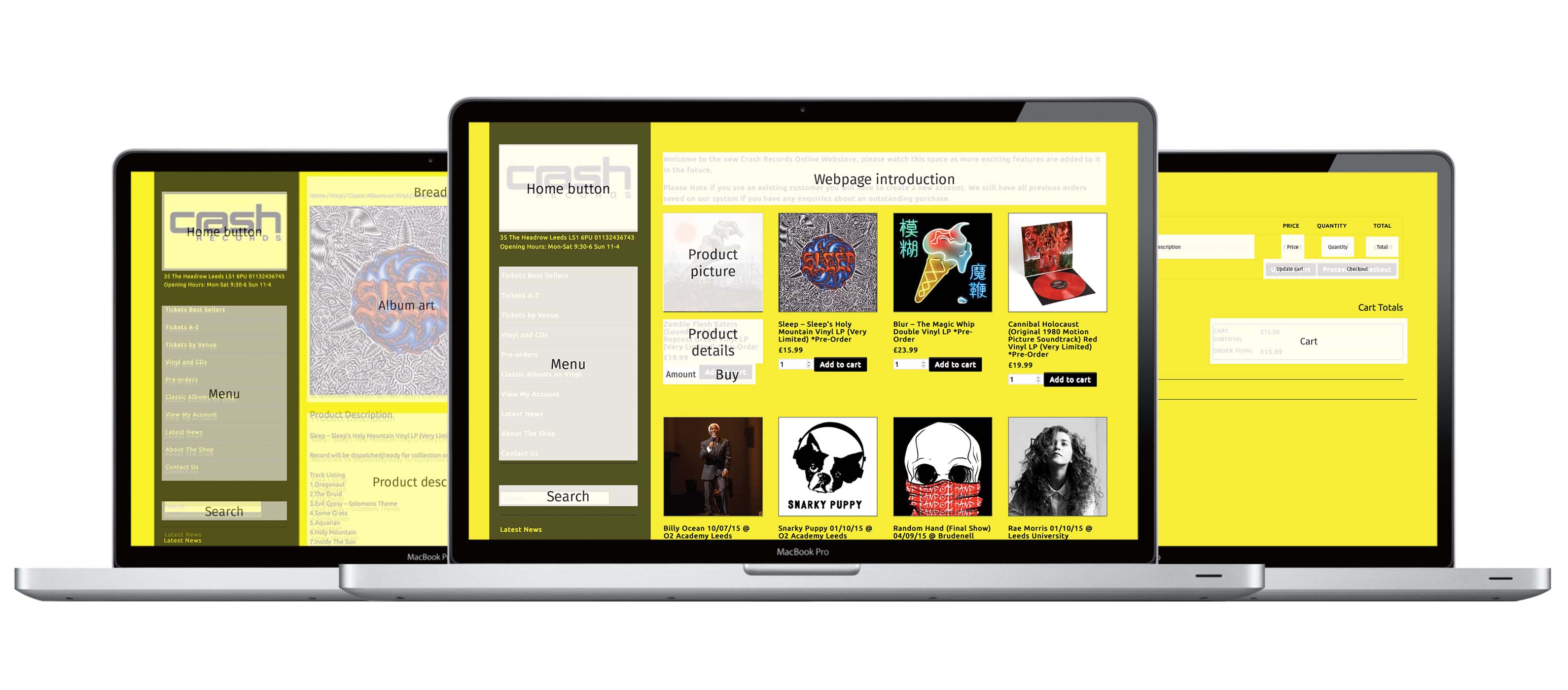
4. User is not provided with sufficient information regarding on which feature of the webshop he or she is currently on (Tickets Best Sellers, Tickets A-Z, Tickets by Venue, etc.).
5. The webshop shows elements only at certain areas. (For the Cart, user has to scroll upwards to see it).
6. Lack of hierarchy: what information is the most important or most searched by its users?
7. The header location is currently on the left side of the webshop.
8. Visibility of the Search box can be improved with an icon of magnifying glass etc. Currently it is not visible and has low priority.
9. Selection criteria of albums on landing page is unclear.
Responsibilities
- Interaction and Visual Designer
Client
- MSc course Visual Communication Design at the Technical University of Delft, The Netherlands
Team
- Sander Välk, Edoardo Fusaro, Rushil Jain & Minsung Kim.
Year
- 2015
Original website layout
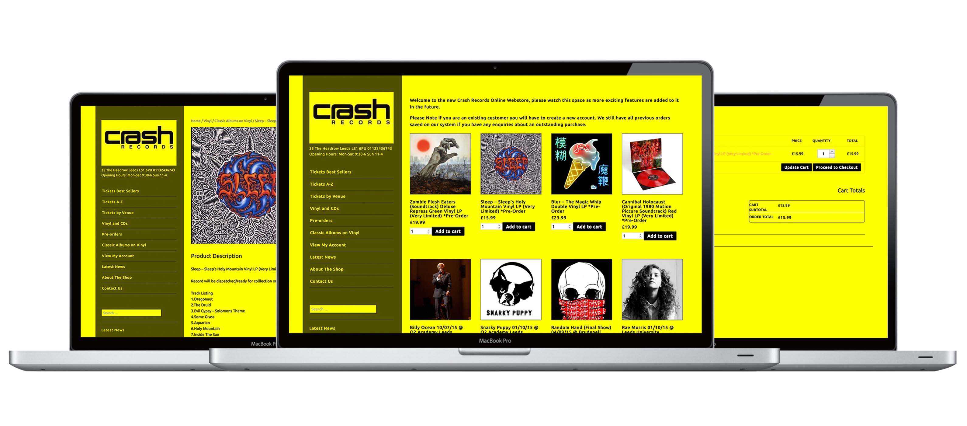
Analysis of current website
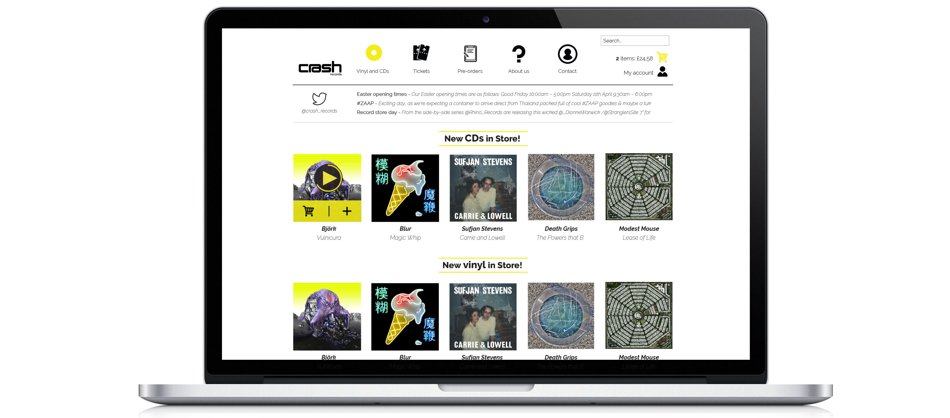
Redesign landing page
Redesign product page

Redesign cart page
